Thursday, 25 June 2015

Blood angels Forgeworld kitbash assault marines.


One of many many projects that got put aside I found in a box and randomly painted a bit of.

These are based on sons of horus reavers and emperors children palantine blades. I used metal blood angel pads and blood drop pads for their shoulders as both kits have legion specific ones. I also used some plastic bits; a blood angel head, helmet and a shoulder pad. I like the idea of the blood angels having the different aspects of the chapter so the savage blood crazed flesh tearers alongside the nobler artisan current blood angels so I've tried to represent both. Now the assault marines have been cut from my troops choice I thought it was about time I painted some up... er... doh!


Here's the three. Goodness knows how many others to do.. but little by little eh?

This guy is my favourite. His sons of horus body with palantine blade weapons gives a nice mix of angry and artisan.

Back shot. I try and do zenith lighting highlights on my models so sometimes random bits are in shadow.


I like yellow.

RARGH! CHAINAXE!

I wanted a big over the top pretty bit in the form of the shoulder pad to balance the big axe bit.

Yellow and hazard stripes make me happy.

Melta. Yes you can never have too much melta.

His spikey backpack is his only angry bit.

I also use green as a spot colour.


Though maybe the rope should have been yellow...

Tuesday, 23 June 2015

Sky shield landing pad


One of our planets, Pyreus 'Roads', is supposed to be a Skyport. So a landing pad was a must.
Here it is! Airbrush project number two.

I went back to my parents and grabbed my old pad out of my wardrobe where it had been sadly unloved for some time. I'd previously based it in brown and then drybrushed it in silvers by hand to try and give it a worn rusty look that hadn't really worked, so I'd painted the eagles bone but chipped.. and that hadn't really worked... so I'd washed bits in different colours to try and save it and that hadn't worked either and my did it look awful.

Enter the airbrush. I sprayed everything with silver. which was a bit light, so I mixed a burnt umber and black wash and toned it down slightly unevenly trying to keep the middle dirtier as if maybe it had been landed on with something with burners. I used white to pick out the aquillae and scroll bits.


Top view. the top lights are a pale turquiose. (NB. I suspect I see green and blue slightly differently to some people, so to me this looks a pale green but I could be wrong!) These were done by just aiming down(ish some fails round about if you look closely) with the airbrush at each light in turn and then adding more white to the mix before doing it again, trying to be quick enough my airbrush didn't seize up but slow enough the paint dried on the model. I was pretty happy with how these looked but felt I probably should have been less lazy and do two to three light colours instead of just one.

Bottom view. I decided to mix up the lights and go with yellow, which has the fun contrast when the side are up which helped me feel less like I'd made a mistake with the all turquiose lights on top. I used a bit less silver and more umber wash to give the bottom a more disused rust feel than the cleaner but burnt top.

I'll try and snap a shot of it when I get it on a board.

Thursday, 18 June 2015

Vindicare finished

Here he is, cunningly hiding on a small patch of dirt in the shadow of a ruined archway that's oddly sitting on a landing pad... (next post spoiler). Sometimes an issue with these bases that they look nuts placed on terrain, it also hides his back detail, but he does look quite sneaky so I'll forgive it.


I did another layer of white on the mask, that might have been an error frankly but never mind.

And the brass details and green highlights on the gun. I love the skull with the bullet hole on the base even if it should have been a helmet as he must have been standing there ages for the flesh to rot off but nonetheless awesome detail.

I went for a grey rock with a base of brown to give his black suit something to look less grey next to.

The base I painted before adding the model so I could just drybrush without fear which is unusual for be because I simply cant be bothered t keep track of different models pieces while I take my sweet time to paint them as I rampantly skip from project to project. I based the arch and rocks in Rhinox hide, painted/heavily drybrushed with eshin grey over leaving brown in cracks, its not really visible to the eye but does change the overall tone. Then a drybrush with dawnstone and a final go with terminatus stone which ties to the sand. The sand was painted in the technical blackfire earth (leaving feet spaces) before being drybrushed in zandri dust and then terminatus stone.

Monday, 15 June 2015

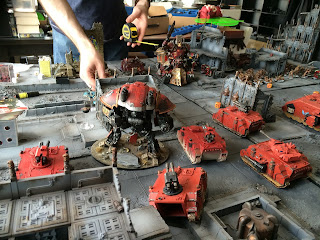
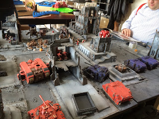
Apocalypse or first turn wins 40k

I used my knight! Vs a Khorne Lord of Skulls! I thought mine was over costed but that Khornate monster is something else.

Basically the game seemed largely to boil down to the fact my team mate seized the initiative and we killed the khorne lord so we were a third up in points. Entertaining game against a very good humored opponent. I wondered if anyone had any strategies to play these games without the 'roll for first turn and the win' feel? Forcing people to use 50% reserves or similar? Bit of a pain to need another table to layout those units and take the time to move them on in an already slow format.

The armies line up.

Lord of war standoff.

The blood angels thought the alpha legion were the ultramarines obviously...

Yes I'm quite good at turning the far future into a parking lot. Sorry.


Tuesday, 2 June 2015

Welcome to the Alvarak System escalation campaign map


My friends and I have been planning a system wide escalation campaign for a few years now and were finally starting. I've set up a blog about our progress and thought I'd link to anyone who was interested in having a look from here: http://alvaraksystemcampaign.blogspot.co.uk/2015/04/welcome-to-alvarak-system.html

Have you and your groups ever run map campaigns and how did they go?
Arthur kindly had an amazing system map commissioned for us and it seems only right to start with it:
Made by battleboards.co.uk it's a thing of awe inspiring beauty. Their web address if you fancy checking them out is at:
My overview shot was a blurry mess so will add one later.  Here is a video of some of the making of this project. It's really very impressive and you can see how some of the board tiles light up and some pro brush control!

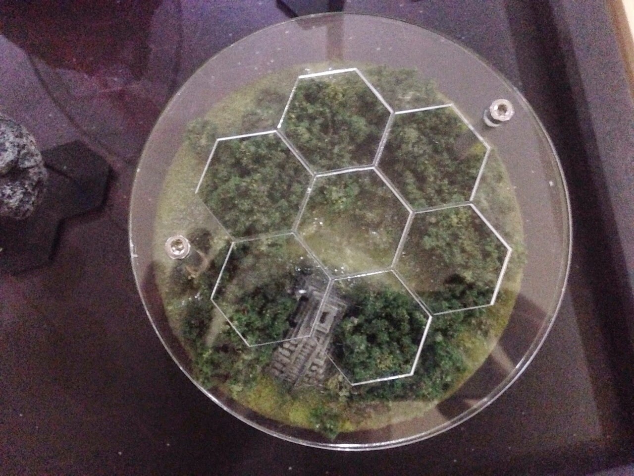
Here comes the image spam! Each of these will get a separate post with background, rules and a terrain list. Each planet has a hexagonal grid in perspex that both protects the tile and allows us to mark our progress during the campaign in little coloured perspex tiles. Genius.

Alvarak Prime


Concentra

Malmoral

Karrara

Gehenna

Epsilon 0111010001011010001010010100010010010010001111001010010010100110
Or E0111 for short. This is my red planet board for anyone who has been following my progress with it!

Memphis

Pyrea "Roads"

Svalbard

There are also three system features that we may throw in if possible. The hulks could make for some zone mortalis. Asteroids? Who knows!

Hulk "The Spawn of Tyamat"

Hulk "Damnations call"

Asteroid Belt Designation 413 "Trader's Peril"