Wednesday, 9 September 2015

Valkyries for my Praetorian IG

I've had a bit of a turn around and decided to move away from the grey I did on my vendetta. It was done some time ago and I think my current desert colour scheme is better, more interesting to look at than something that's mainly grey and silver and ties in better with my tanks when they're all the same basic colour scheme.

This leaves me with somewhat of a quandry regards my older vendetta (and the other two I've got still siting in pieces in boxes some years after I did the first... sigh.) will I repaint the old one. Will I paint the newer two with the new colours. Should I stick to gunships being an imperial navy colour scheme and if so could I make it more interesting with some fenris blue-grey cammo and perhaps some sky underbelly? Anyway for now my three valkyries that I've had in a cupboard for about three years now are getting some desert cammo with sky belly love.

I've never done any masking before so don't really know what I'm doing, I've just used invisible tape as it was what I had to hand! Seems to have worked out really pretty well oddly/luckily enough..

The cockpits and interiors were prepainted by whoever I bought them off on ebay. They've got some fun colour helmets which I like even if they're not quite up to the standard I'd have done them I don't want to risk breaking all the canopy bits ripping them off so that's how they're going to stay.

I started off by masking off the cockpits and giving all three a coat of army painter leather brown on all the cammo areas.

You can make out my dodgey invisible tape masking, especially where I began to remove it before taking the shot! I airbrushed on some skyblue.

It actually came out quite well!

And again.

and again.

and once more for luck. You can better see the contrast here, I chose to do sidewalls in cammo with the idea the blue would be very visible if the plane was on the ground, I like how it looks even if its wrong!

I shaded in armour plate joins, rivets, random divits, etc. with sepia and used a little to make trails where grease, grime and rust might have been dragged out during flight.

Weathering proper began on one wing to check out it looked alright. I used a brush to do sharp thin strokes using rhinox hide and then metal along panel and wing edges where damage might be caused. I used sponge weathering to add lighter damage to the main parts of panels, perhaps where paint has distorted a peeled in the sun and finally small lines of highlighted semi circles containing a line of rhinox hide to represent where old chips and scratches had occurred trough the paintwork and then left to tarnish over time.

Another angle of this, overall it builds up to quite a nice effect.

The same effects on the underside of the wing... that possibly no one will ever look at again... sob.


Overhead shot, weathering complete.

Cockpit and nose shot with obligatory angry face painted on (pre weathering so the scratches could get it a little!)

Close up of mr grumpy.


The plane is going to fly a building around with it... its a bit large I know but otherwise the massive bases look rather empty with just normal flock and rubble on. A Praetorian casualty or two might have to find their way onto here but I'll paint them up separately and make sure the flight stand fits around them.
The flight stand will sit on the floor tiles.

The other side of the base.

I've started the hazard stripes around the jet engine intakes, wouldn't want anyone accidentally popping their fingers in before take off. Just these and the base to do to finish the first one... then just another two more!

Wednesday, 2 September 2015

Adeptus Arbites and repressor (space marine scouts with elysian forgeworld heads) campaign unit.

Has anyone one looked on ebay for adeptus arbite models recently? Wow they're expensive...

So I decided to use space marine scouts with shotguns and give them elysian heads from forgeworld. The aim was to look sufficiently grim dark and give a nod of the head to Judge Dredd.

I chose a black and grey colour scheme with bright spot colours to draw the eye a little. I wanted to speed paint these guys (complete fail on the repressor in that regard.) and I wanted to try out using my airbrush to zenith highlight these guys to save any painting with a brush before detailing.

I undercoated them in chaos black spray. (Thinking of buying a Vallejo air primer, anyone got any experiences of these? Good colours etc.?) Then used dark grey and light grey from above and on the base with a little sky blue mixed in to the dark grey (to go with my friends city board).


With some bright colours! the red and the yellow on the helmets are my nod to dredd's red rimmed faceplate and gold icon on the helmet.

Weird overhead shot! I added some sponge weathering to their armour and guns but apparently didnt take a shot of them on their own with this... oops.

The repressor. Initaly weathered black with the brass eagles and red guns it seemed a bit bland. Enter the hazard stripes (and the failure to speed paint!). I ended up adding the grey panels to try and help them tie into the arbite infantry as I ended up doing them much lighter than planned in my head.
The dusty weathering is just terminatus stone stippled on with a tank brush.

Front shot. The pretty badly obvious magnets are to attach the dozer blade which I did later.


Together shot

Overhead shot. I added more terminatus stone above where dust might have collected on the tank. The board is a pretty war torn city. Actually the forgeworld urban tiles with ruined buildings in a fenris grey tone.

I took quite alot of shots here...

Dozer blade. I lost my mind and went for more hazard stripes for my meatwagon. I like how it looks alot but it took longer than planned to get done.

The dozer blade in place. I'm really happy with how this came out and I'm looking forward to popping this down in a game soon. Just got to get another 5 Adepts done to fill out the squad... flamers for two of them I think. I wanted to have some variety in poses so was looking for my scout bikers as I know they have a fun 'waving my shotgun around by the grip' arm but I can't seem to find them at present..


Friday, 24 July 2015

Rage of Sadmar

 I felt I should post up my thoughts on the new game. It might help to vent.

It has been obvious from the complete lack of balance in both warhammer and 40k that GW are phoning in the rules. Despite having produced more and more of their most beautiful models to date both through the end times and in 40k. However it seems they've decided just to give up. I do understand that from a company management point of view this might seem like a very good idea. Alongside the stripping down of staff from stores, the 'Eavy metal team and closing of stores. Cheeky rules re releases such as the new edition of 40k with terrible magic rules and vehicles that supposedly anti vehicle weapons cant actually kill outright or the imperial knight book which added four new weapon options to a codex that already consisted of very few rules and while I admit there was more errata/added formations outside the old book than pages in it having to pay for a new full price book after just a year is to me offensive, particularly given the complete imbalance between imperial and eldar knights and the lack of chaos knights.

Terrible rules have probably been responsible for some of their problems with sales such as the wood elf book releasing the gorgeous treeman and new combat units that were all nerfed in the book and made to look unplayable next to the boosted archer types most people would have already owned models for. The imperial guard as astra militarum was another, new gorgeous storm troopers that replaced models people probable already had but didn't fit in with the esthetic of the rest of the army. A new very expensive in money terms transport that again has an odd look and feels worse than a chimera with front AV11. Ogryns... why bother? These cost almost as much as terminators in points for one extra shot and no armour worth mentioning and no equivalent combat benefits. The hydra that sixth edition rules turned from one of the most playable tanks in 40k to one of the worst that duels as the wyvern that seems alright as a one of. Deliberate moves to make you buy multiple books such as the skitarii and adeptus mechanicus being seperate even though the mechanicus book clearly having a heavy support choice for its troops due to a lack of models and the skitarii having no HQ are also insulting and books like the eldar making wraith guard and knights have d weapons regardless of balance to try and sell more and jetbikes all being able to take heavy weapons in a clear middle finger wave to the dark eldar kin again simply to sell models with no regard of what will happen to the game.

So the solution is to give up making rules for one game system. Throw away the support of those who have supported it for years and to give up. The new rules make imbalance even worse and actually quite hard to balance your army for even casual games against friends. When a war scroll can contain three highelf mages on dragons, the emperor karl franz or twenty zombies these are clearly not comparable by war scroll or by wounds.

The models are undoubtedly gorgeous, but why buy them if the game isn't worth playing. Something as tactical as push your guys in the middle and hope you roll first for combat multiple turns in a row just isn't a game I'm interested in. Nor is one where to use certain units you need to move 60 zombies per turn. Going to be great fun pulling out the vampire counts now eh?

My biggest question and complaint is why this is a separate game to warhammer?
The problem with warhammer was supposedly its complicated rules and large model count which acted as a barrier to new players. Well why not introduce a new game in addition that stepped up to it. That the models for simply ranked up in greater numbers? Even if warhammer was relegated to the specialist games tab that would have been something. I don't understand how GW expect to make more money off a game that makes people buy less books, less terrain, less models, less paints, etc.

Competing with the popular newer skirmish games such as warmahordes and mallifaux was a good idea, but at the expense of one of their core products seems like madness.

Thursday, 25 June 2015

Blood angels Forgeworld kitbash assault marines.


One of many many projects that got put aside I found in a box and randomly painted a bit of.

These are based on sons of horus reavers and emperors children palantine blades. I used metal blood angel pads and blood drop pads for their shoulders as both kits have legion specific ones. I also used some plastic bits; a blood angel head, helmet and a shoulder pad. I like the idea of the blood angels having the different aspects of the chapter so the savage blood crazed flesh tearers alongside the nobler artisan current blood angels so I've tried to represent both. Now the assault marines have been cut from my troops choice I thought it was about time I painted some up... er... doh!


Here's the three. Goodness knows how many others to do.. but little by little eh?

This guy is my favourite. His sons of horus body with palantine blade weapons gives a nice mix of angry and artisan.

Back shot. I try and do zenith lighting highlights on my models so sometimes random bits are in shadow.


I like yellow.

RARGH! CHAINAXE!

I wanted a big over the top pretty bit in the form of the shoulder pad to balance the big axe bit.

Yellow and hazard stripes make me happy.

Melta. Yes you can never have too much melta.

His spikey backpack is his only angry bit.

I also use green as a spot colour.


Though maybe the rope should have been yellow...

Tuesday, 23 June 2015

Sky shield landing pad


One of our planets, Pyreus 'Roads', is supposed to be a Skyport. So a landing pad was a must.
Here it is! Airbrush project number two.

I went back to my parents and grabbed my old pad out of my wardrobe where it had been sadly unloved for some time. I'd previously based it in brown and then drybrushed it in silvers by hand to try and give it a worn rusty look that hadn't really worked, so I'd painted the eagles bone but chipped.. and that hadn't really worked... so I'd washed bits in different colours to try and save it and that hadn't worked either and my did it look awful.

Enter the airbrush. I sprayed everything with silver. which was a bit light, so I mixed a burnt umber and black wash and toned it down slightly unevenly trying to keep the middle dirtier as if maybe it had been landed on with something with burners. I used white to pick out the aquillae and scroll bits.


Top view. the top lights are a pale turquiose. (NB. I suspect I see green and blue slightly differently to some people, so to me this looks a pale green but I could be wrong!) These were done by just aiming down(ish some fails round about if you look closely) with the airbrush at each light in turn and then adding more white to the mix before doing it again, trying to be quick enough my airbrush didn't seize up but slow enough the paint dried on the model. I was pretty happy with how these looked but felt I probably should have been less lazy and do two to three light colours instead of just one.

Bottom view. I decided to mix up the lights and go with yellow, which has the fun contrast when the side are up which helped me feel less like I'd made a mistake with the all turquiose lights on top. I used a bit less silver and more umber wash to give the bottom a more disused rust feel than the cleaner but burnt top.

I'll try and snap a shot of it when I get it on a board.

Thursday, 18 June 2015

Vindicare finished

Here he is, cunningly hiding on a small patch of dirt in the shadow of a ruined archway that's oddly sitting on a landing pad... (next post spoiler). Sometimes an issue with these bases that they look nuts placed on terrain, it also hides his back detail, but he does look quite sneaky so I'll forgive it.


I did another layer of white on the mask, that might have been an error frankly but never mind.

And the brass details and green highlights on the gun. I love the skull with the bullet hole on the base even if it should have been a helmet as he must have been standing there ages for the flesh to rot off but nonetheless awesome detail.

I went for a grey rock with a base of brown to give his black suit something to look less grey next to.

The base I painted before adding the model so I could just drybrush without fear which is unusual for be because I simply cant be bothered t keep track of different models pieces while I take my sweet time to paint them as I rampantly skip from project to project. I based the arch and rocks in Rhinox hide, painted/heavily drybrushed with eshin grey over leaving brown in cracks, its not really visible to the eye but does change the overall tone. Then a drybrush with dawnstone and a final go with terminatus stone which ties to the sand. The sand was painted in the technical blackfire earth (leaving feet spaces) before being drybrushed in zandri dust and then terminatus stone.

Monday, 15 June 2015

Apocalypse or first turn wins 40k

I used my knight! Vs a Khorne Lord of Skulls! I thought mine was over costed but that Khornate monster is something else.

Basically the game seemed largely to boil down to the fact my team mate seized the initiative and we killed the khorne lord so we were a third up in points. Entertaining game against a very good humored opponent. I wondered if anyone had any strategies to play these games without the 'roll for first turn and the win' feel? Forcing people to use 50% reserves or similar? Bit of a pain to need another table to layout those units and take the time to move them on in an already slow format.

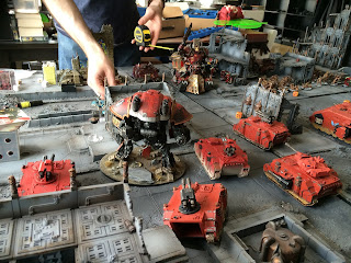
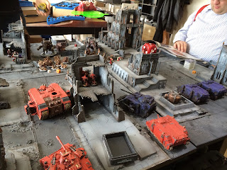
The armies line up.

Lord of war standoff.

The blood angels thought the alpha legion were the ultramarines obviously...

Yes I'm quite good at turning the far future into a parking lot. Sorry.


Tuesday, 2 June 2015

Welcome to the Alvarak System escalation campaign map


My friends and I have been planning a system wide escalation campaign for a few years now and were finally starting. I've set up a blog about our progress and thought I'd link to anyone who was interested in having a look from here: http://alvaraksystemcampaign.blogspot.co.uk/2015/04/welcome-to-alvarak-system.html

Have you and your groups ever run map campaigns and how did they go?
Arthur kindly had an amazing system map commissioned for us and it seems only right to start with it:
Made by battleboards.co.uk it's a thing of awe inspiring beauty. Their web address if you fancy checking them out is at:
My overview shot was a blurry mess so will add one later.  Here is a video of some of the making of this project. It's really very impressive and you can see how some of the board tiles light up and some pro brush control!

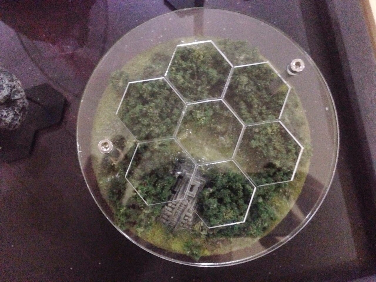
Here comes the image spam! Each of these will get a separate post with background, rules and a terrain list. Each planet has a hexagonal grid in perspex that both protects the tile and allows us to mark our progress during the campaign in little coloured perspex tiles. Genius.

Alvarak Prime


Concentra

Malmoral

Karrara

Gehenna

Epsilon 0111010001011010001010010100010010010010001111001010010010100110
Or E0111 for short. This is my red planet board for anyone who has been following my progress with it!

Memphis

Pyrea "Roads"

Svalbard

There are also three system features that we may throw in if possible. The hulks could make for some zone mortalis. Asteroids? Who knows!

Hulk "The Spawn of Tyamat"

Hulk "Damnations call"

Asteroid Belt Designation 413 "Trader's Peril"